
Branding SURGICAL MESH
TECHNOLOGY FOR ETHICON
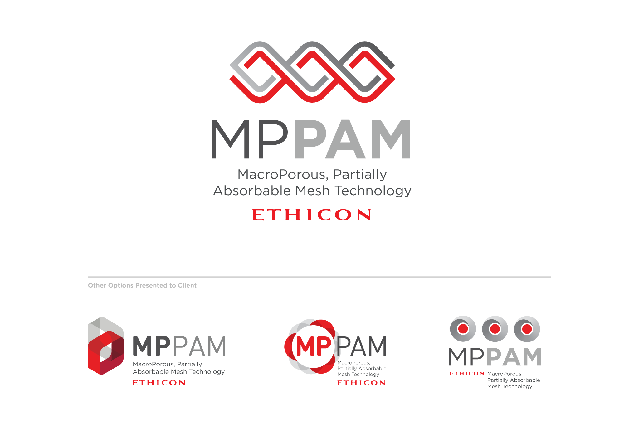
My challenge was to create a logo that fit within the Ethicon’s product line and that illustrated their new mesh technology. Their MPPAM technology allows 50% of fibers to absorb liquid while the other 50% are insoluble and keep the integrity of the surgical mesh. After I designing and presenting several options we chose and moved forward with an identity that showed the technology in the most literal way. This logo was prominently displayed on Ethicon’s UltraPro product packaging to tout their unique offering. I truly enjoyed immersing myself in this scientific challenge and am proud of the result.

CRAFTING AN IDENTITY FOR A NEW TYPE OF BANK
After hurricane Sandy hit New Jersey in 2012, the state created a bank to keep funds and support for future natural disasters and energy crises, a critical and new type of bank. I designed a pattern of squares with connecting structures implying a supporting network that add redundancy and resilience. A luminous color palette conveys a sense of energy, the blue and green tone evoke wisdom and reliability.

BRANDING THE JOHNSON & JOHNSON DIGITAL LEARNING INITIATIVE
Supporting employee learning is a top priority of Johnson and Johnson and aligns with their Credo. Their digital learning initiative provided employees with learning opportunities around product design and development and needed it’s own brand for their internal website and comms. The design needed to fit within J&J’s corporate brand guidelines while meeting our objective to inspire employees to learn and build new skills. To accomplish that we wanted it to evoke a sense of play in order to welcome and not intimidate employees.


